07 / 08
Vortex
Blockchain Security · Brand Identity
A logo and brand identity system with visual foundations and brand guidelines.
- Role
- Brand Designer
- Year
- 2025
- Scope
- Logo Design, Branding, Brand Identity
- Tools
- [PLACEHOLDER]
Overview
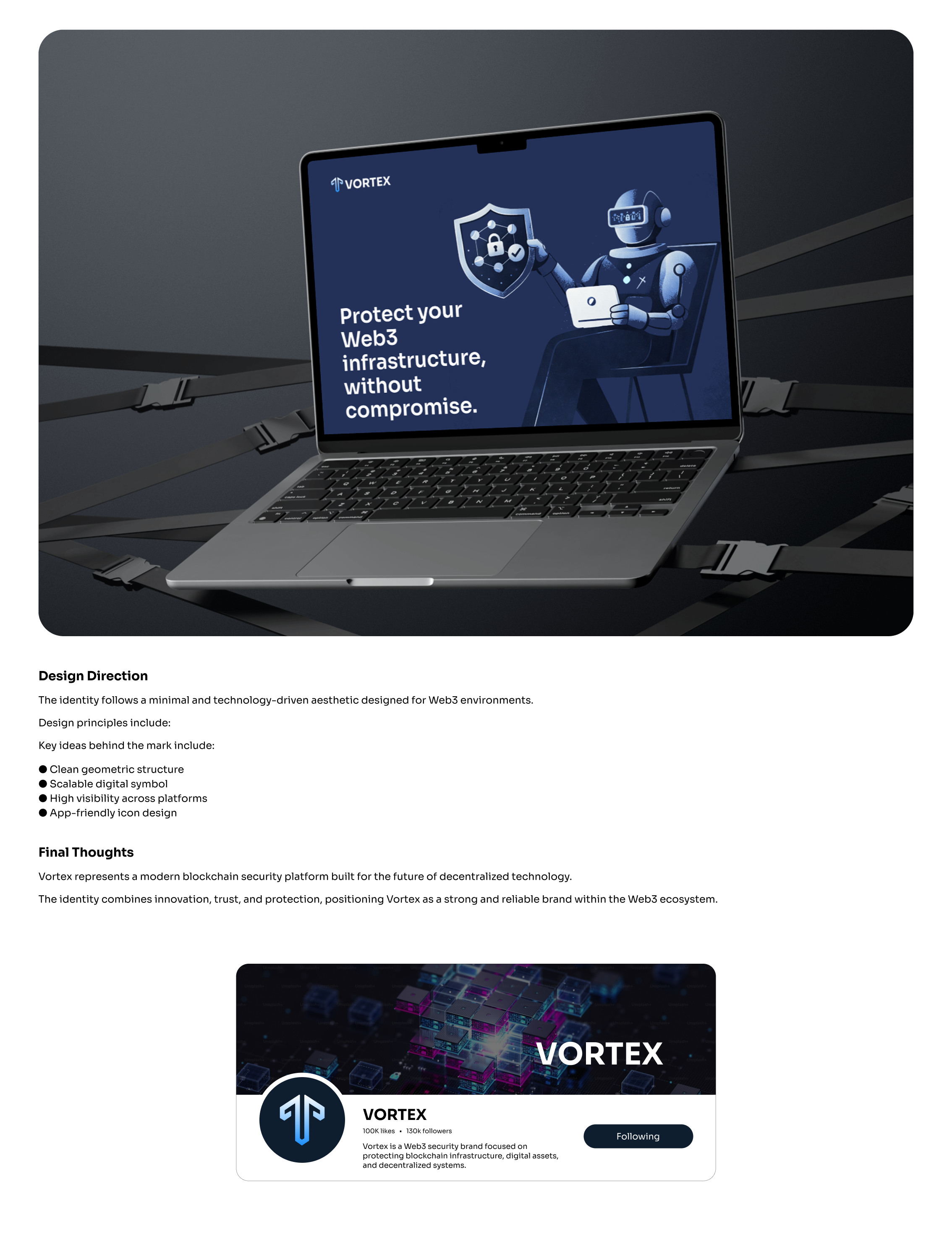
Vortex is a Web3 security brand focused on protecting blockchain infrastructure and digital assets. The goal was to create an identity that felt secure and technically capable without falling into the usual visual clichés you see across the Web3 space. I worked on the identity from the logo and visual direction through to its wider brand applications.
BRAND DIRECTION
The visual direction came from the idea of protection in a digital world — dark, focused and precise, with moments of bright blue bringing energy into the system. Rather than making the brand feel intimidating, I wanted it to have a sense of confidence: serious about security without constantly needing to say it.
Logo
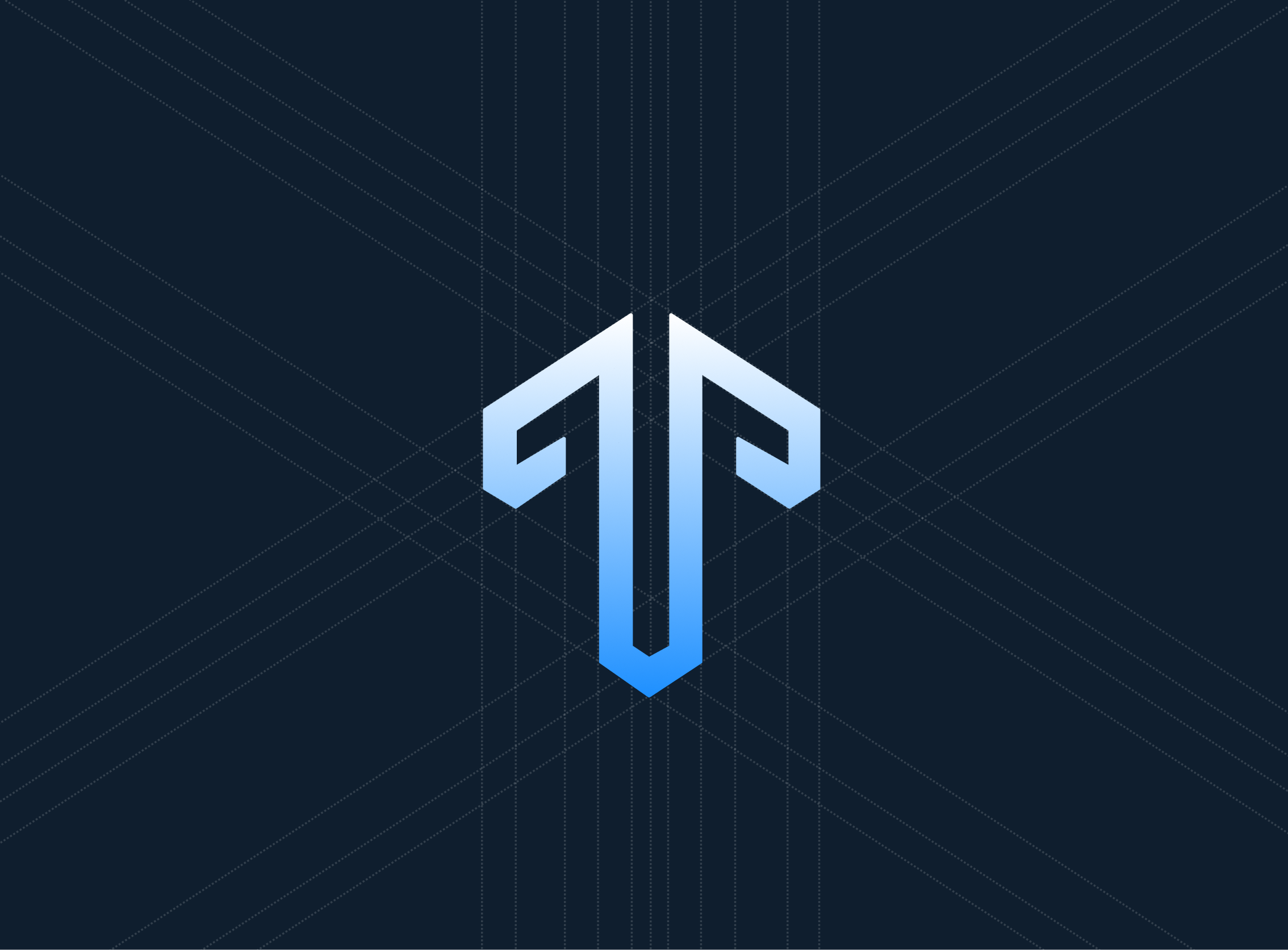
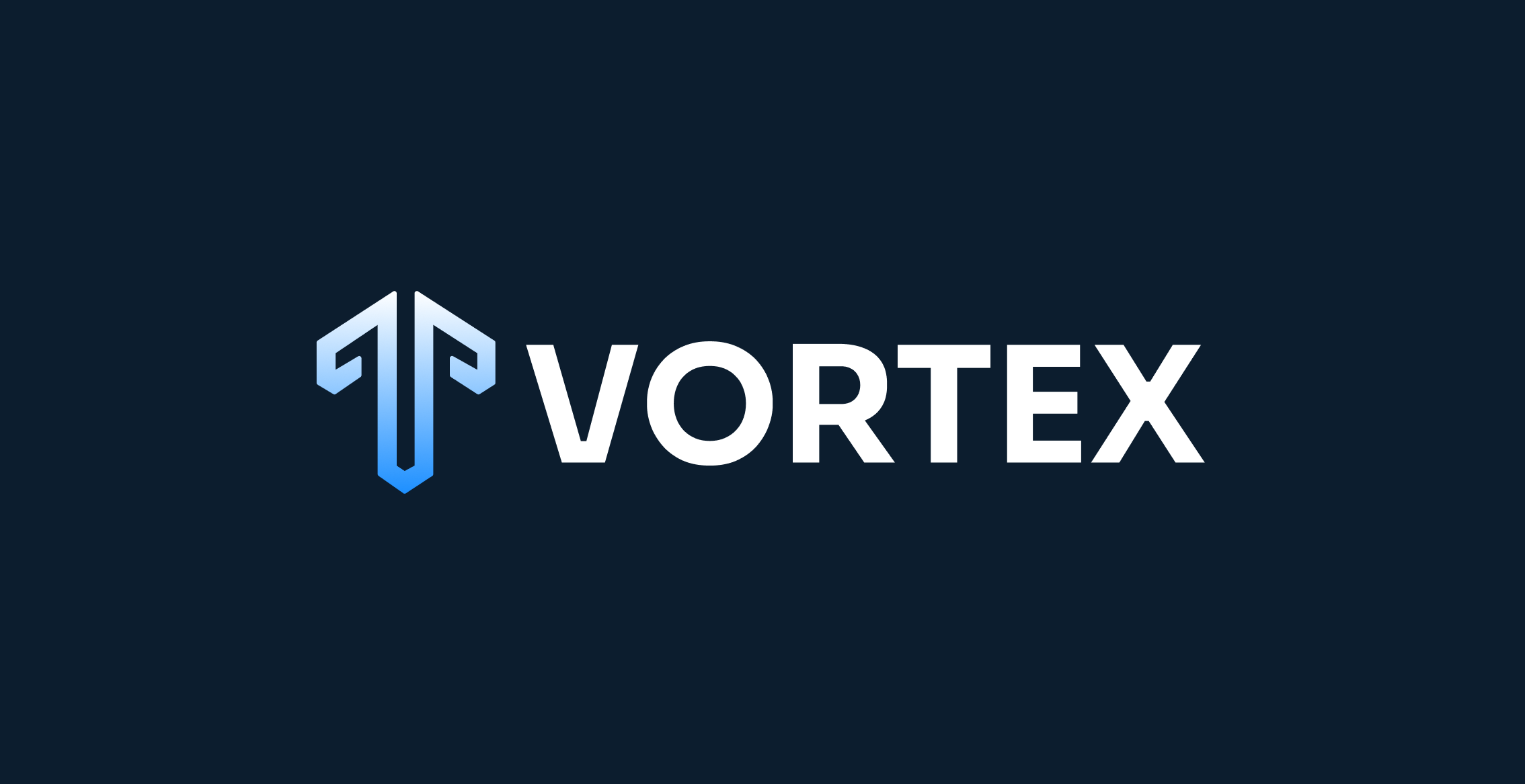
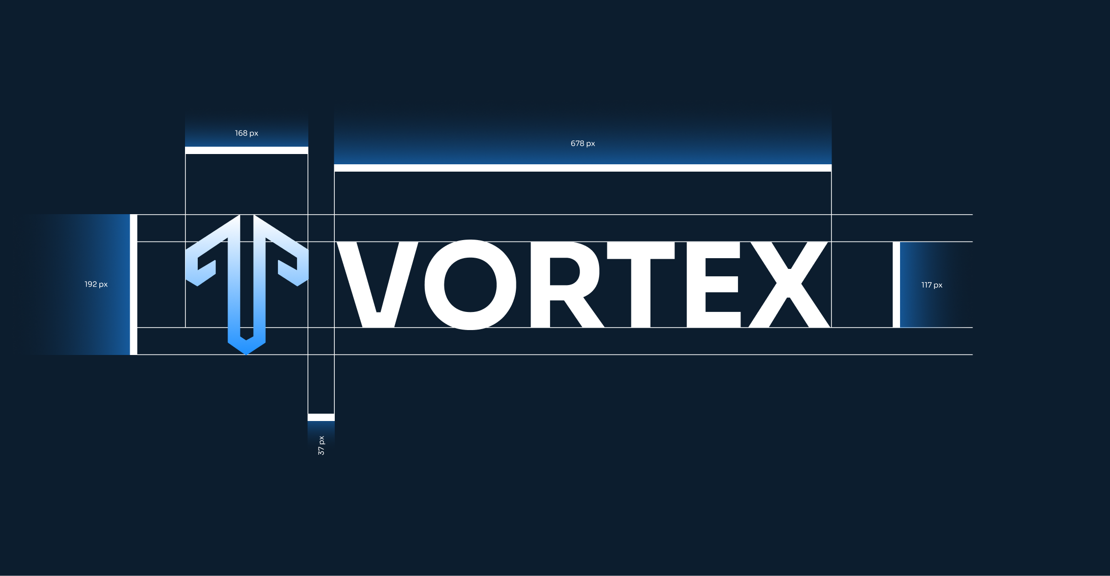
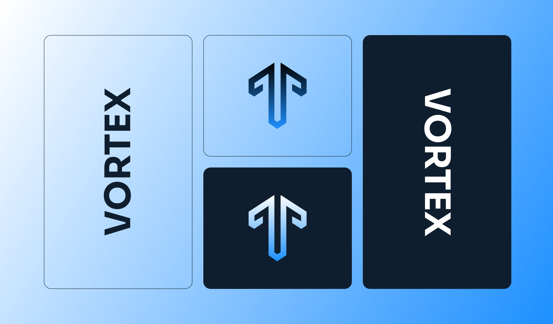
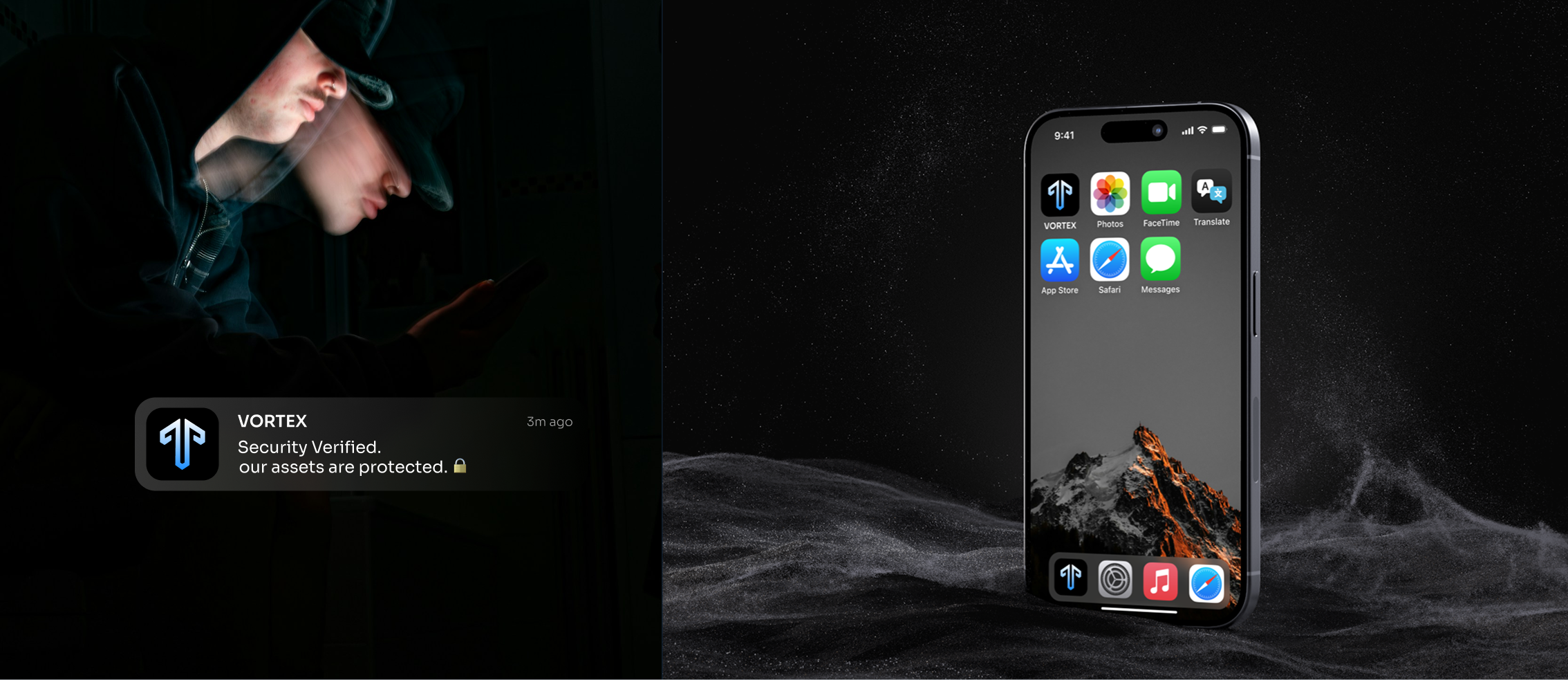
The logo went through different explorations around protection, movement and the letter V before arriving at the final mark. The result is a simple geometric symbol that feels structured and secure, while being distinctive enough to work on its own at small sizes.
Dark Blue
#0F1E2E
White
#FFFFFF
Blue
#1E90FF
VISUAL IDENTITY
The identity uses a deep navy palette with electric blue and white, paired with Sora for a clean, contemporary feel. The logo, typography, imagery and supporting graphics all work within the same visual language, giving Vortex a system that feels connected without every piece looking exactly the same.
BRAND IN USE
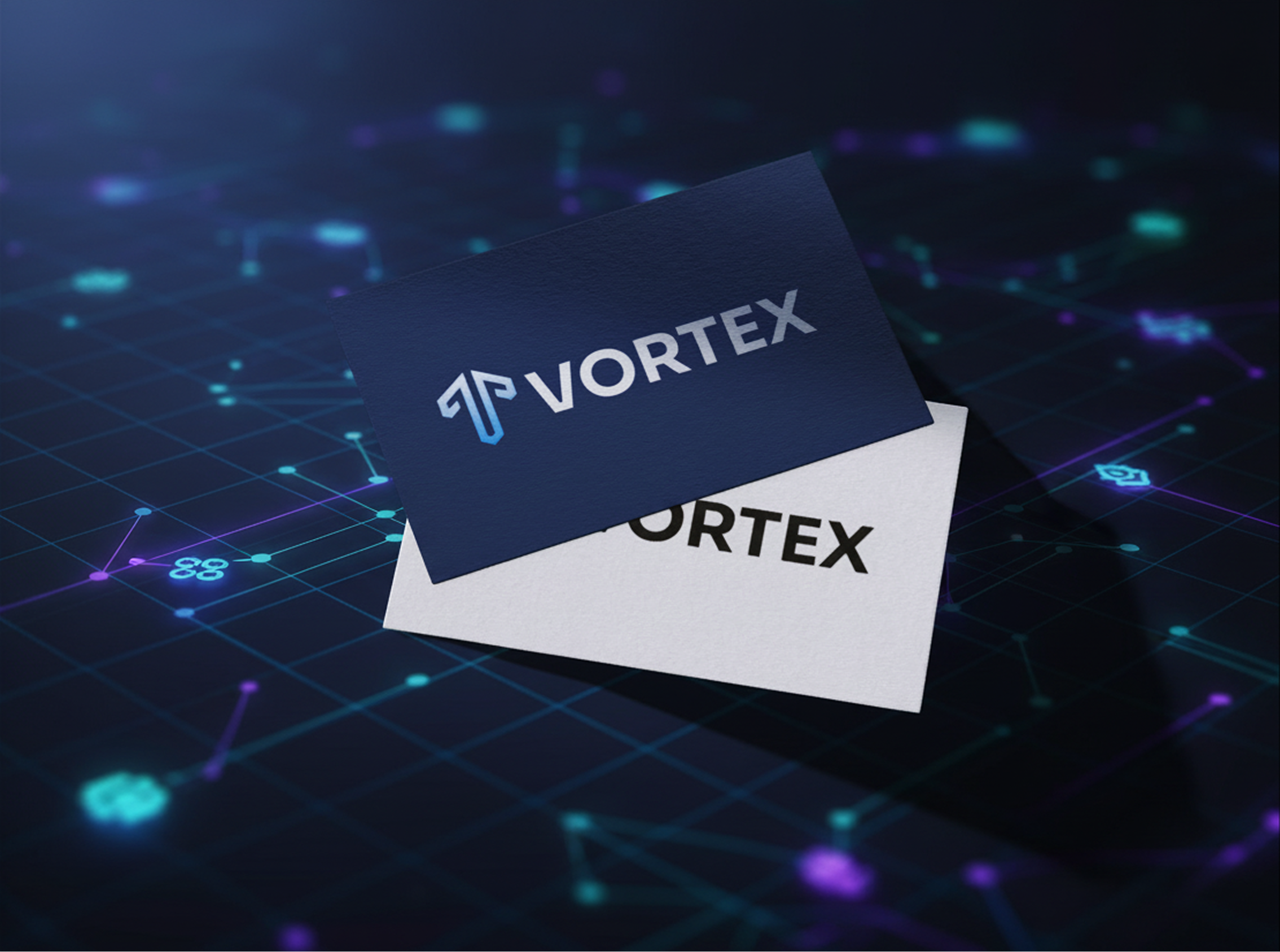
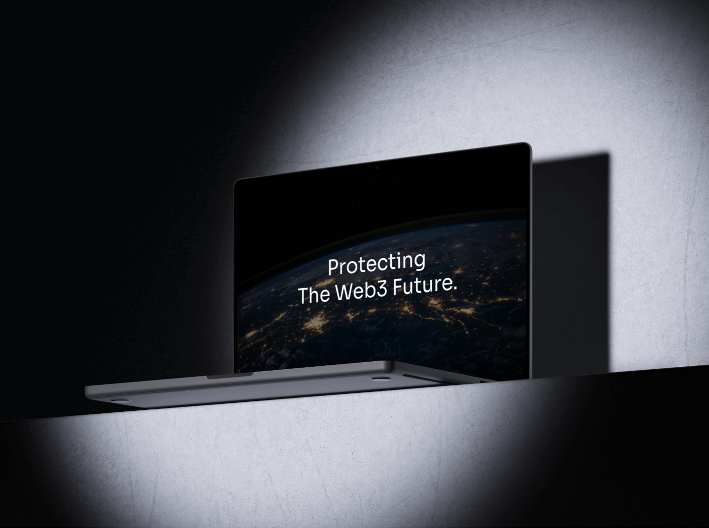
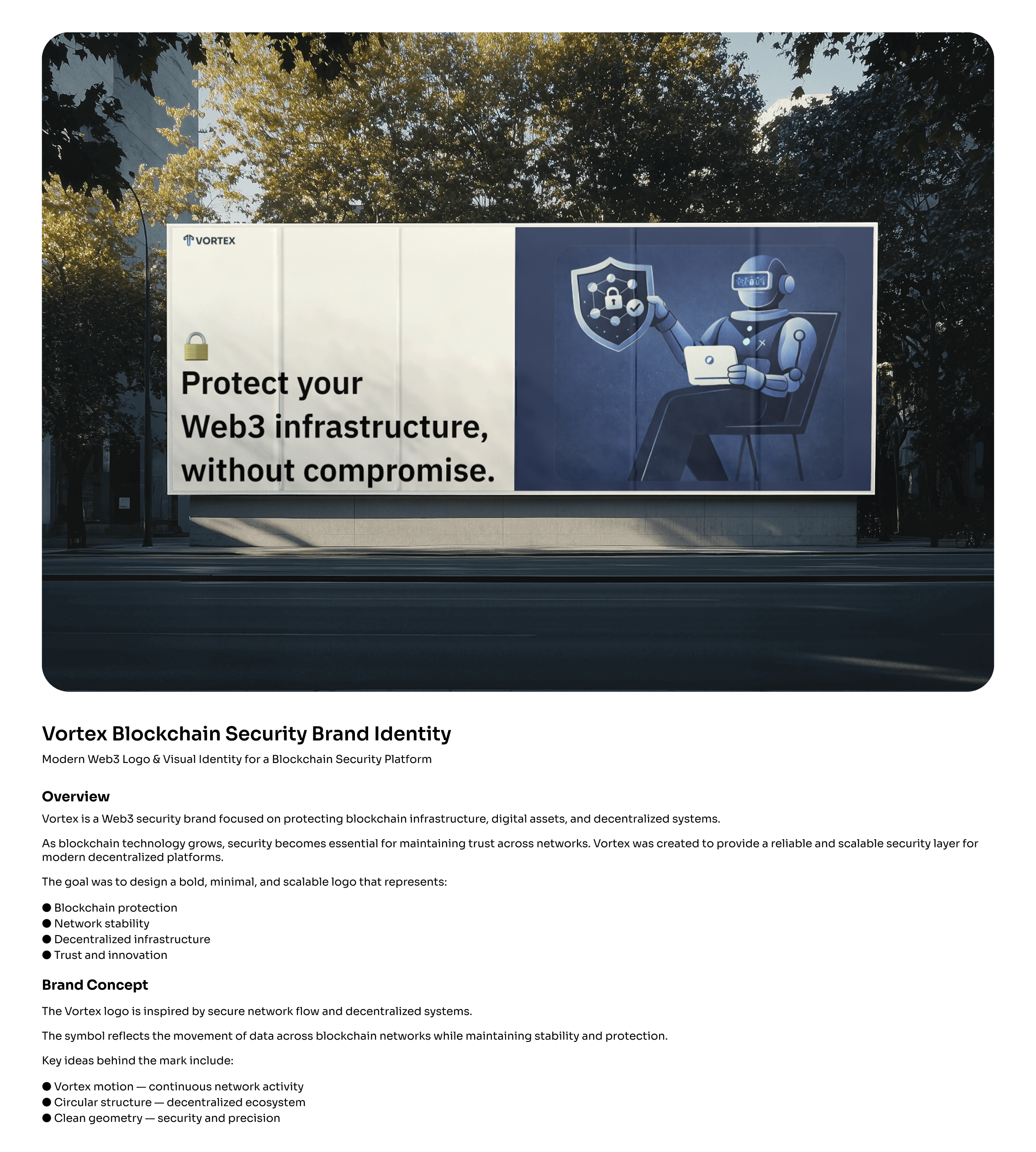
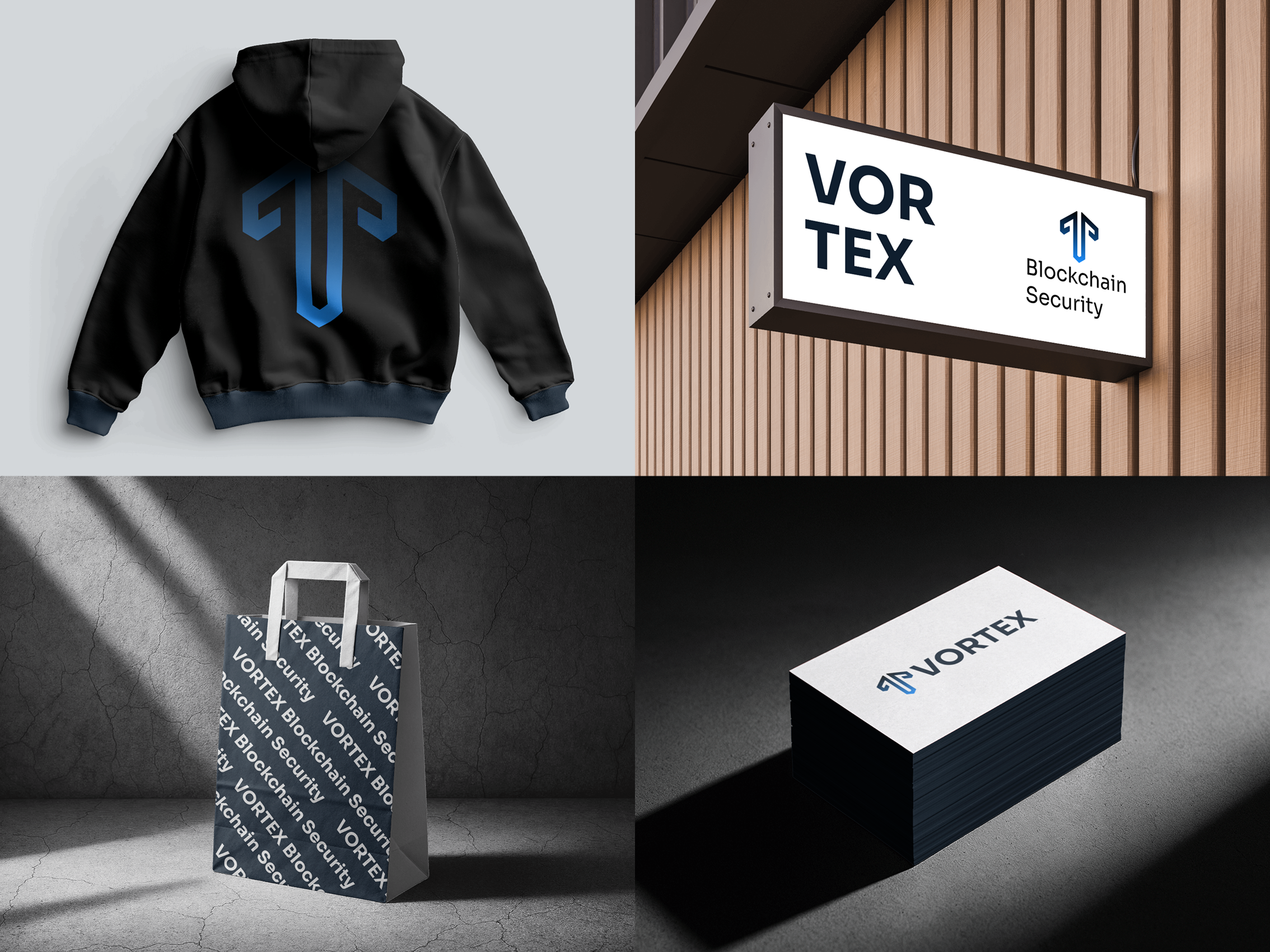
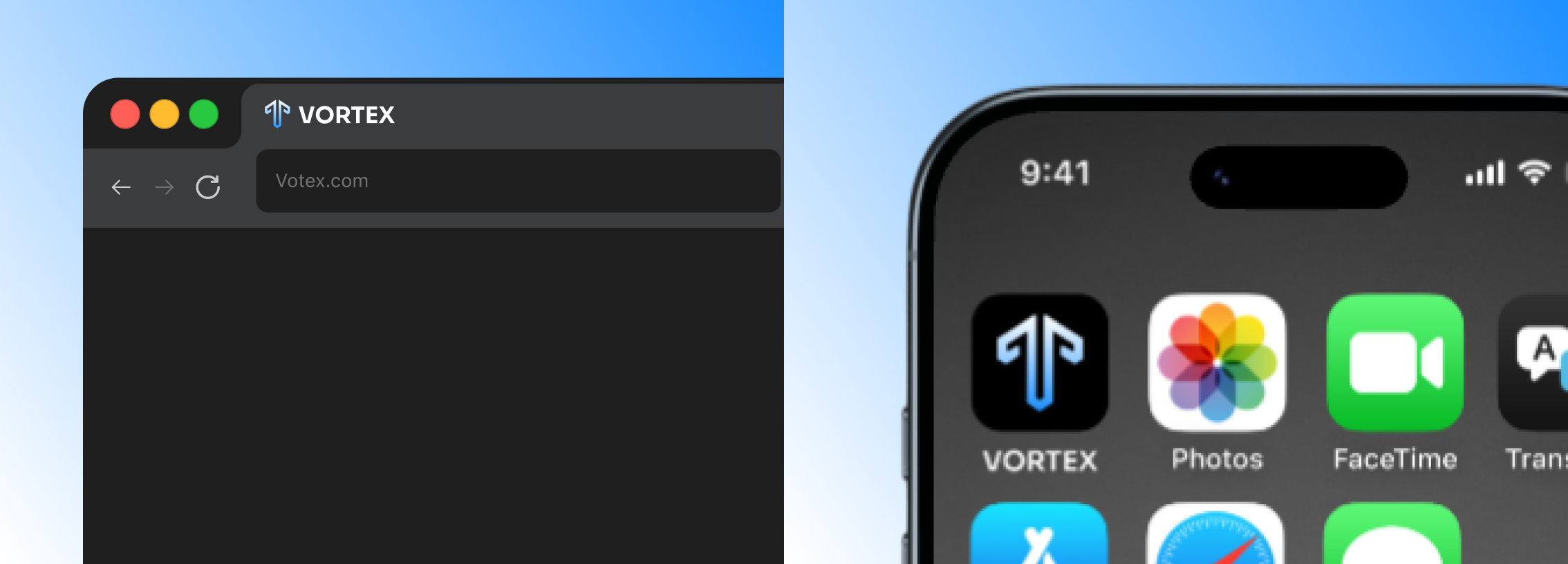
I extended the identity across digital products, social content, outdoor advertising, business cards, apparel and other touchpoints. This helped test how the brand would behave in the real world from something as small as an app icon to something as large as a billboard.
Guidelines
[GUIDELINES: 2–3 sentences on the brand guidelines]
Outcome
The final identity gives Vortex a clearer and more recognisable presence while still feeling at home in the Web3 security space. One of my biggest takeaways from the project was that designing for tech doesn't always mean making things look more technical sometimes clarity and restraint communicate confidence better.