01 / 08
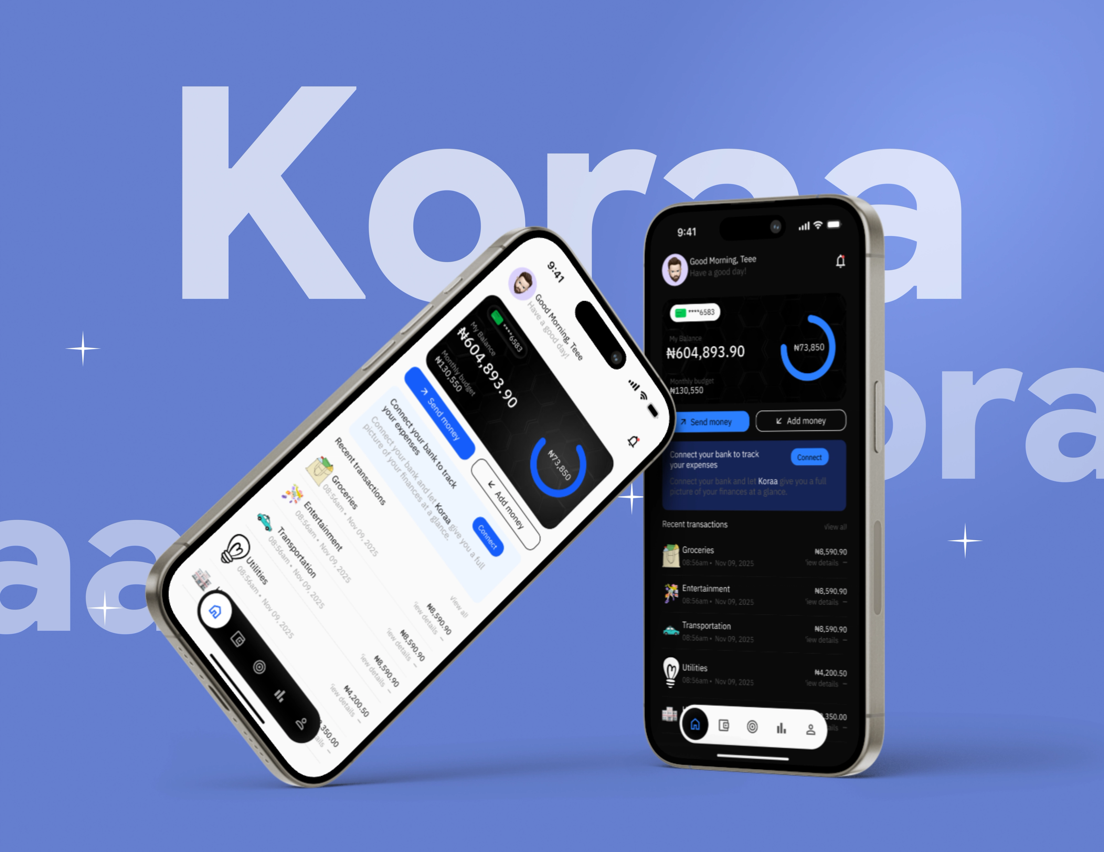
Koraa
Fintech · Budgeting & Savings App
A budgeting and savings app taken from research and wireframes through flows to an interactive prototype.
- Role
- Product designer
- Year
- 2025
- Scope
- UX Research, UX/UI Design, Prototyping
- Tools
- Figma, FigJam
Overview
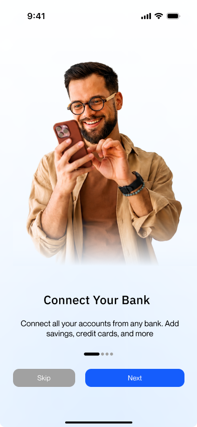
Koraa is a budgeting app designed to make managing money feel less overwhelming. The brief was to create a simple experience where people could understand their spending, set budgets and savings goals, and keep track of their finances without feeling like they were staring at a spreadsheet. I worked on the product design from research and early flows through to the final interface.

The Problem
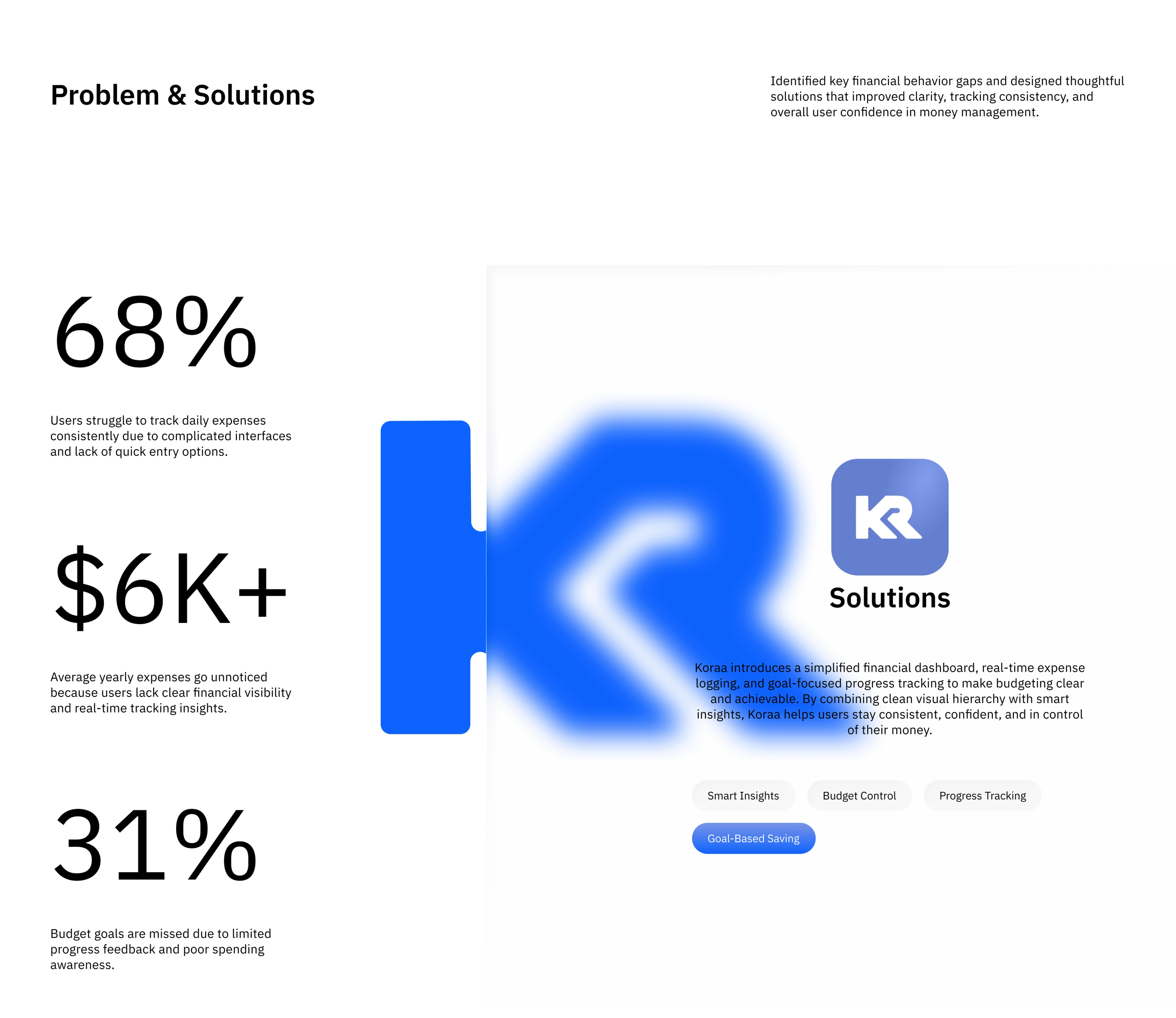
A lot of people want to be better with money, but actually keeping track of where it goes can be tiring. Expenses are easy to lose track of, savings goals get forgotten, and many finance apps throw so much information at users that managing money starts to feel like another chore.
Research
I looked into how people currently budget, what usually makes them give up, and the information they actually care about when checking their finances, scanned through competitors. A recurring theme was simplicity: people wanted to quickly know what they had spent, what they had left, and whether they were still on track with their goals.
Process
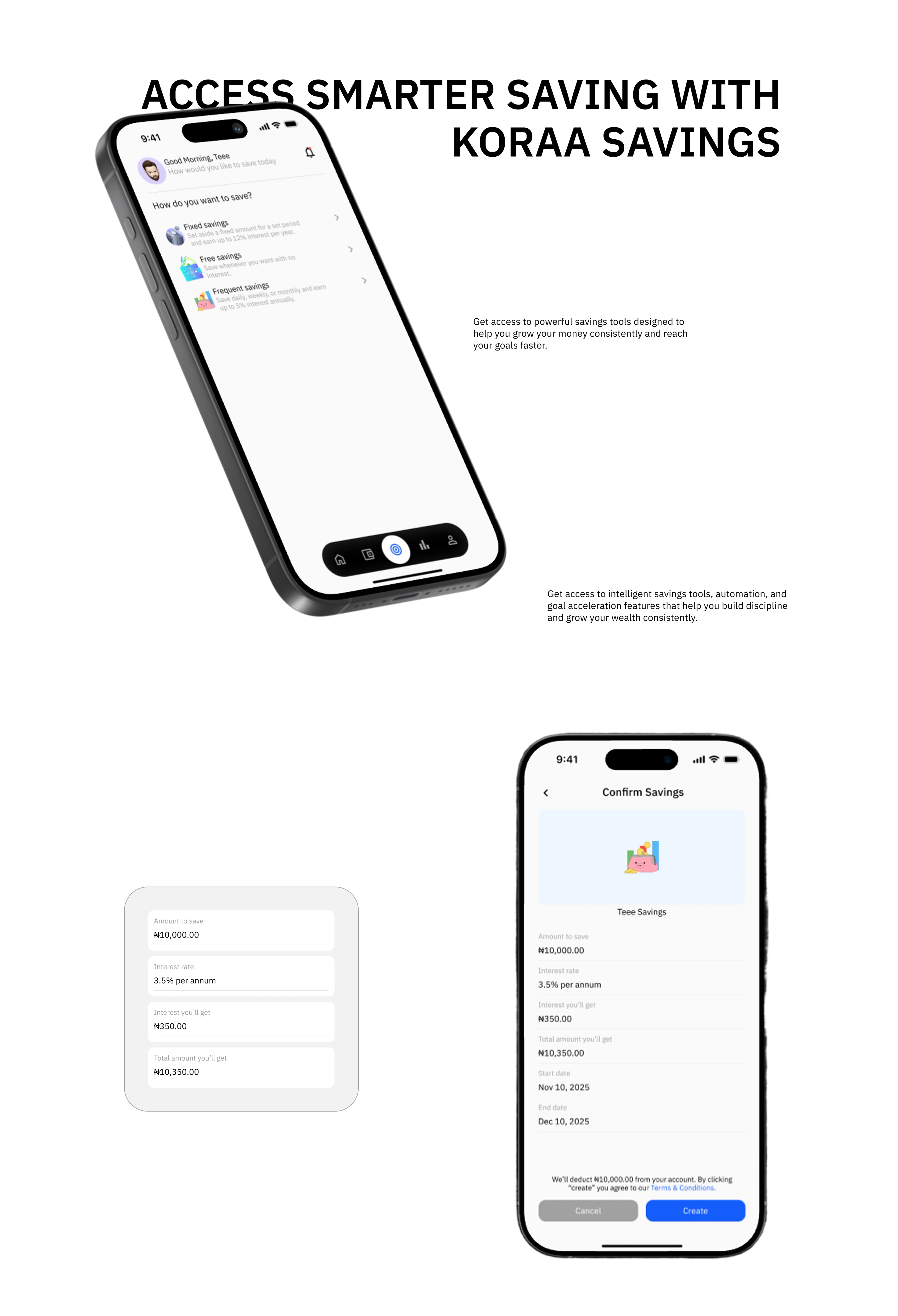
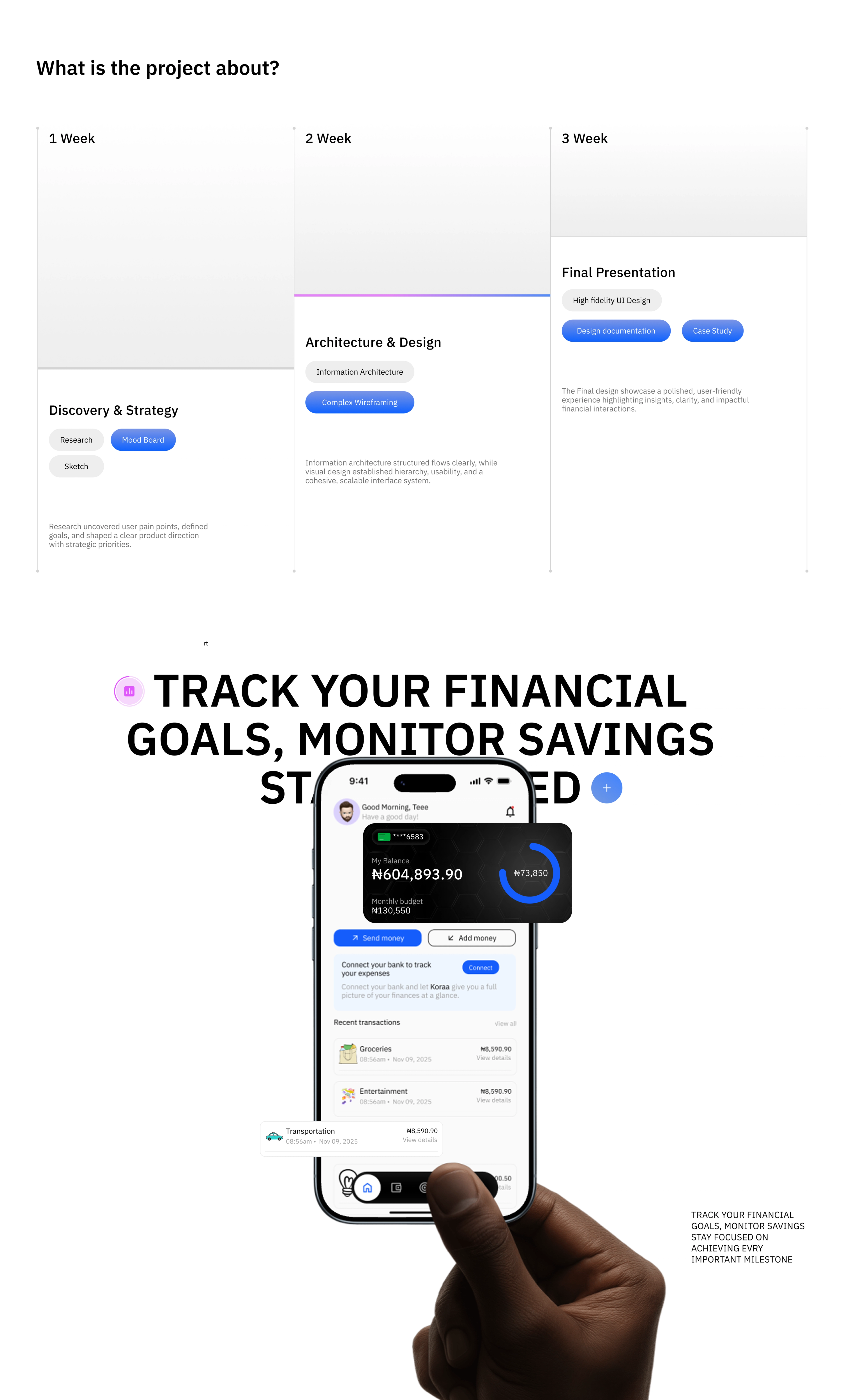
I started by mapping the main things someone would need to do in Koraa and reducing them into straightforward flows. As the design evolved, I kept removing unnecessary steps and refining the hierarchy so important information like spending, budgets, transactions and savings could be understood at a glance.
The Solution
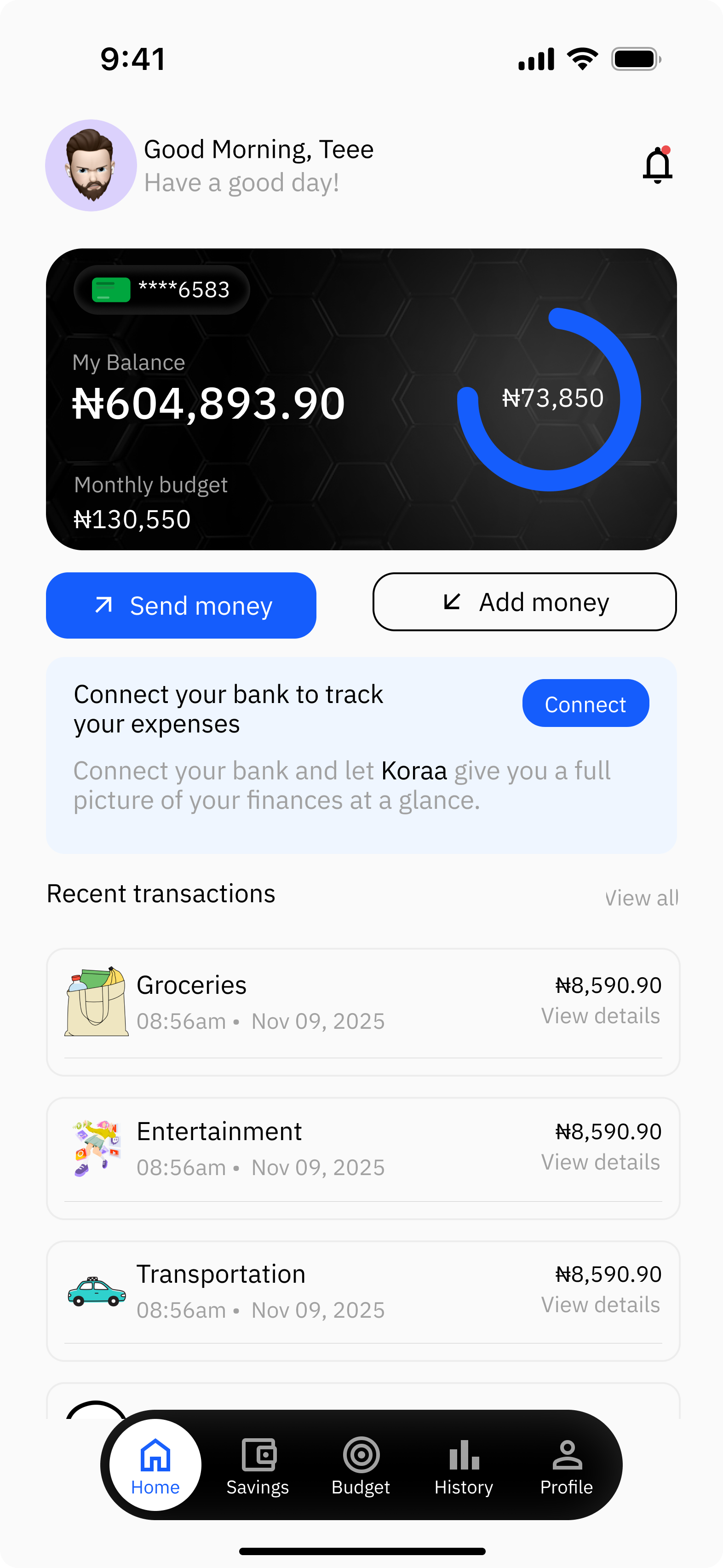
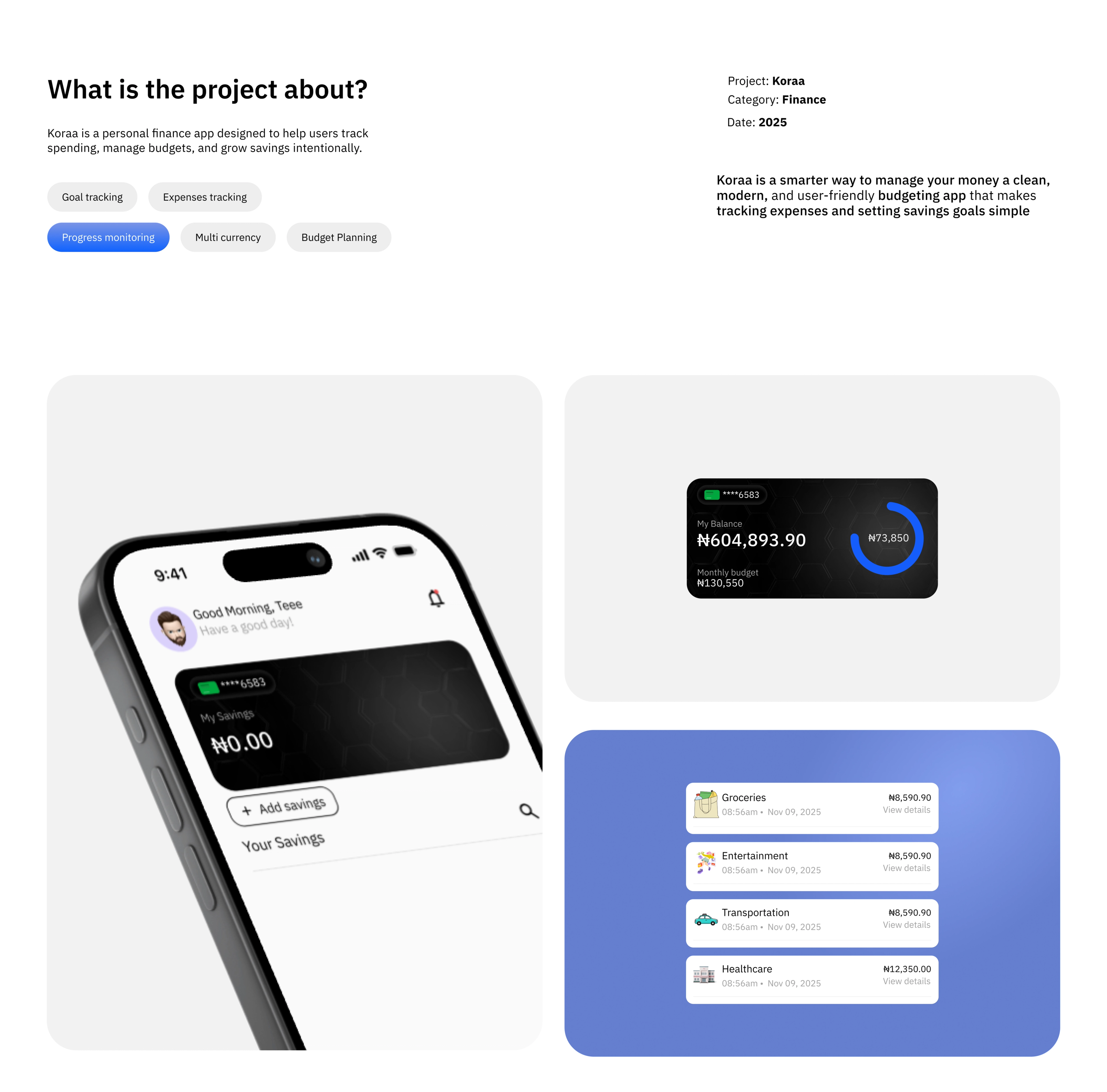
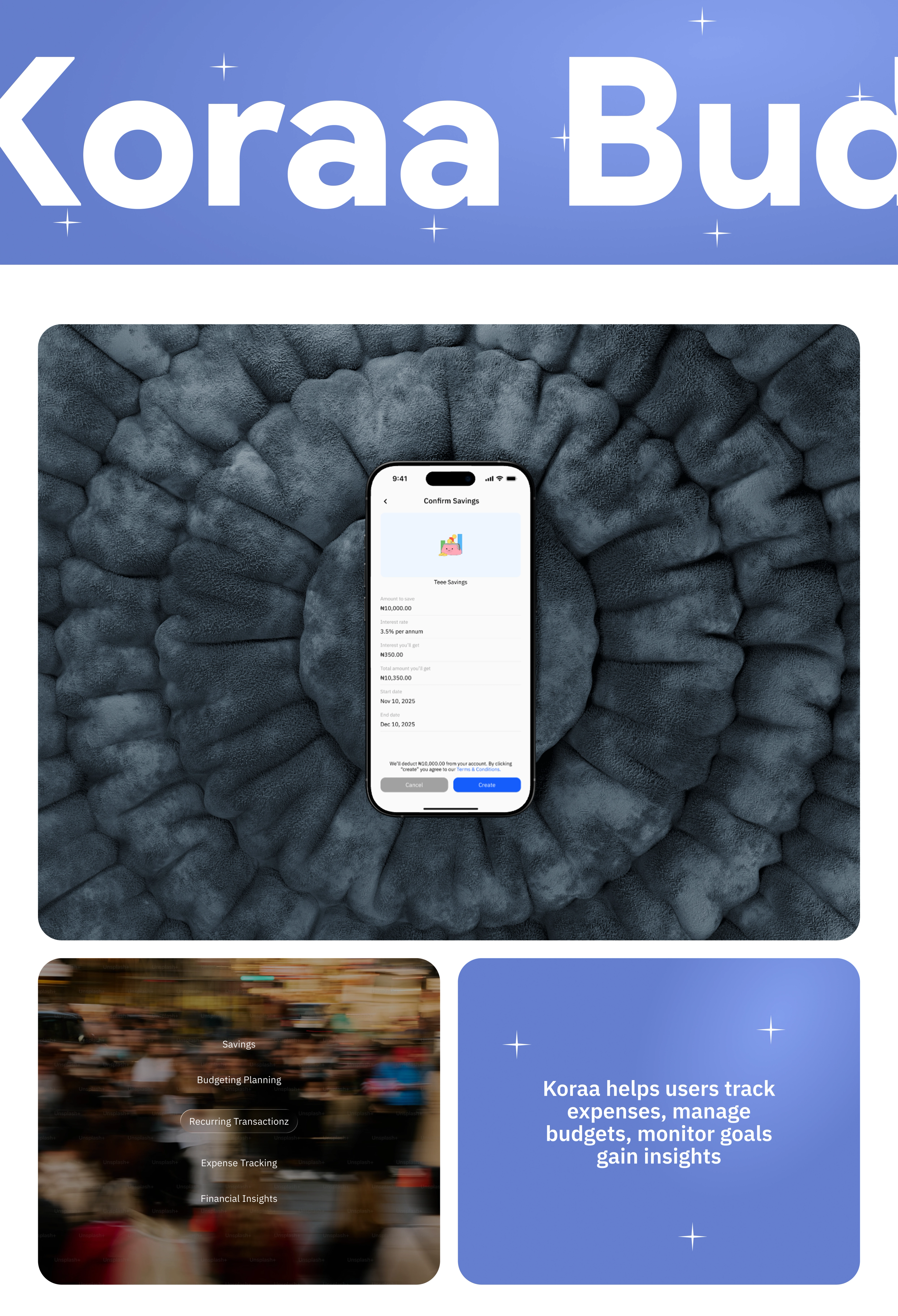
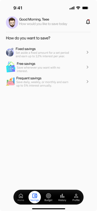
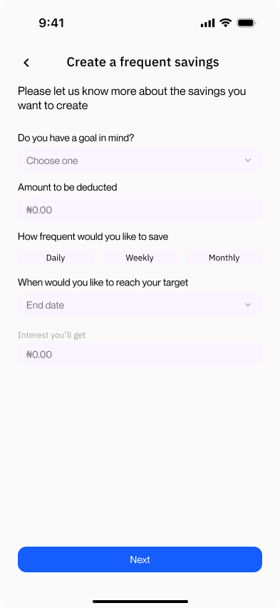
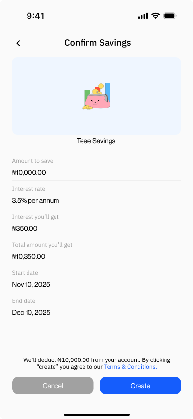
The final experience brings budgeting, expense tracking and savings into one clear dashboard. Users can see their financial activity, understand where their money is going, create budgets and savings goals, and check their progress without having to dig through the app.
Outcome
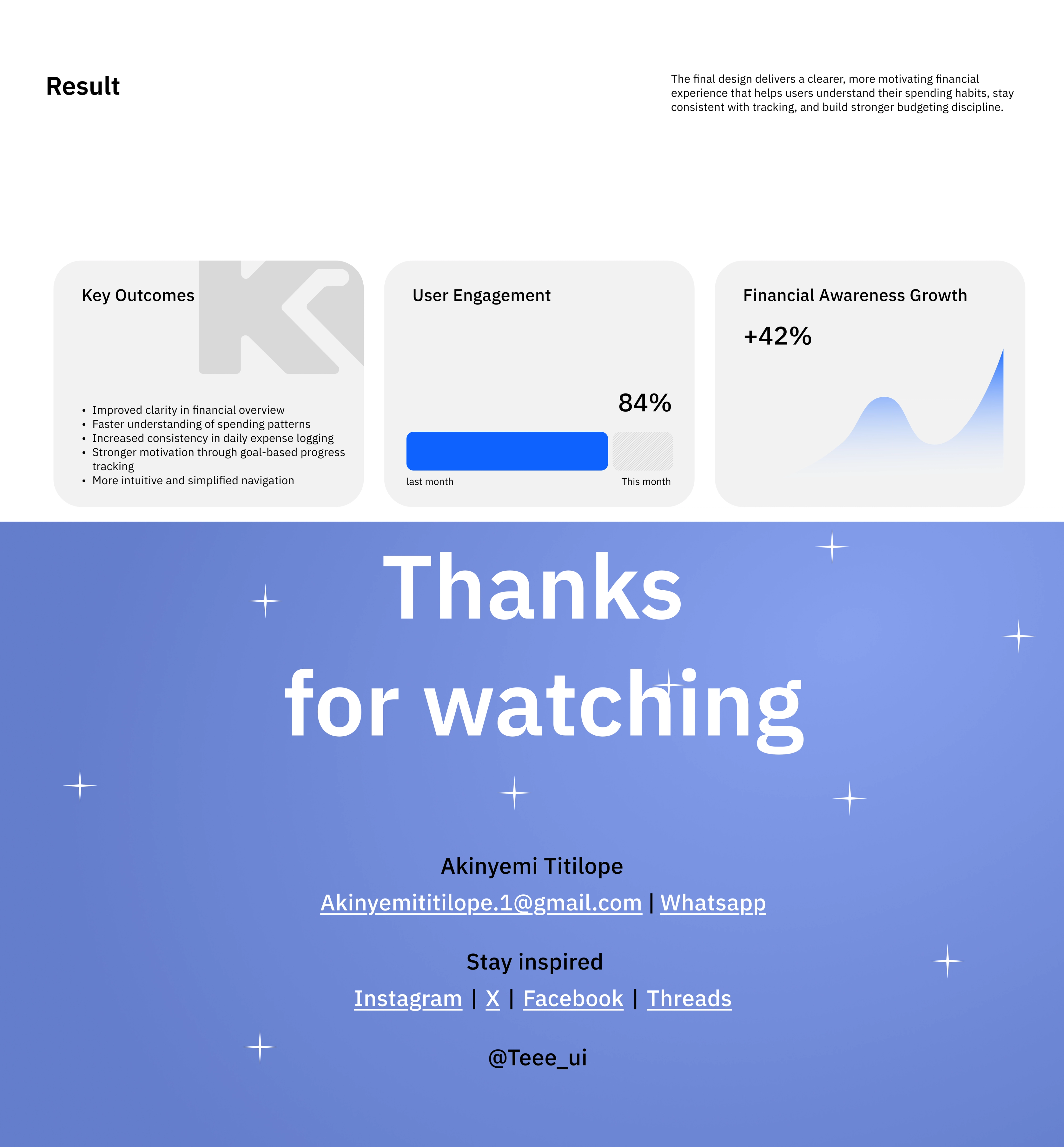
Koraa became a much clearer and more approachable way to stay on top of everyday finances. The project reinforced something I kept coming back to throughout the design: when it comes to money, showing people more information isn't always better — helping them understand the right information is.